Do you remember when you (or a family member) brought home your first computer? I do.
It was right around 1995 when my dad purchased a Packard Bell (when I called him to talk about this blog, he informed me that his first PC was a Commodore Vic 20). At 10 years old, this technological marvel that he brought into our home fascinated me and drew my attention right from the second it was plugged in. The main draw? Packard Bell’s Navigator, an alternative shell for Windows 3.1 - specifically, Kidspace.

I spent a lot of time playing using the Navigator Kidspace and playing games like 3-D Dinosaur Adventure
that came with my dad's Packard Bell.
Just look at the GUI and the icons here! We’ve come quite a long way since 1995, haven’t we? Today I’m going to take a look at how icons have developed and changed over the years. To start, we’re going to have to jump back quite a bit before my first computer memories into a time before I was born: 1973.
Xerox Alto

The Xerox 8010 Star’s icons laid the foundation for how future icons would develop.
As you can see, Calculator, Document, Folder, and Trash have barely changed!
The Xerox Alto debuted in March of 1973 and was the world’s first GUI (Graphical User Interface) based computer system. With only 2,000 machines worldwide, the Alto was originally built as a research computer and wasn’t available for commercial release. In 1981, the Xerox Star came out as the first consumer GUI computer. It incorporated many of the design features of the Alto and was the basis for how a lot of our computer icons developed over time.
1983 Apple Lisa

You can see that Lisa’s icons aren’t all that different from Xerox’s, except for the size and single pixel outlines.
The “preferences” icon, as time has gone on, has been replaced to look like a cog in most cases.
Apple’s goal with the Lisa was to make navigation easier for new users. To do this, they implemented drop-down menus, folder-based directories, and movable “Desk accessories” that were basically early widgets.
1984 Apple Macintosh
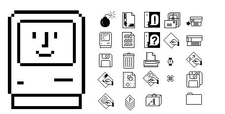
This was the first time an artist was brought in to design the icons.
Apple hired Susan Kare, who went on to do many other icon designs in the future.
Only a year later, Apple released its first Mac. The icons for this machine were clear and concise, plus they carried over certain things from their predecessors that made them instantly recognizable (notice that “Trash” and “file” are still very distinct). Apple’s goal was to remain user-friendly and boost themselves in the commercial market.
There are a few other developments between the 1984 Mac and what’s next on our list, but for brevity’s sake I am going to skip over them and into 1985, when Microsoft breaks into the market.
1985 Windows 1.0x

The Windows 1.0x icons weren’t all that fancy, and they didn’t include color.
Not to be outdone, Microsoft released its first GUI in 1985, just two years after Apple’s Lisa debuted. By the time it was released, Windows had color and all the usual GUI elements like scrollbars, window control widgets, and menus. Each application actually had its own menu bar (just below the title bar) attached to it, unlike the single menu bars on Lisa and Macintosh.
1991 Macintosh System 7

This was the first Mac OS with colors!
The icon images have changed slightly to be a little more dimensional - they appear slightly raised.
System 7 was codenamed “Big Bang” and was introduced on May 13, 1991. It remained Mac’s main OS until OS 8 in 1997, and added features like virtual memory, personal file sharing, QuickTime, QuickDraw 3D, and of course, an improved user interface.
1992 Windows 3.1
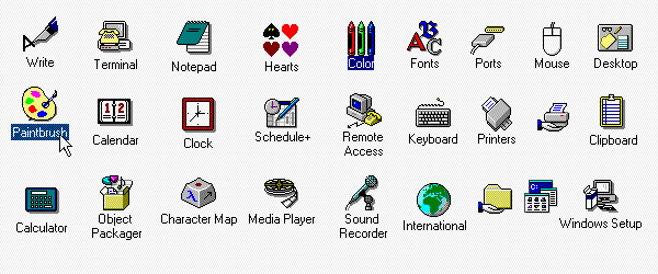
Microsoft hired Susan Kare to greatly improve the icon design for 3.0. For 3.1, she refined the colors and designs of the icons.
Windows 3.1 is my earliest memory of an OS (and of course, at the time, I didn’t even know what the heck an OS was). I rarely used it as intended, however, since I spent most of my time using the Navigator “alternative shell” that came with my dad’s Packard Bell computer. Although, the icon design pictured above was still evident throughout even Navigator.
1995 Windows 95

Hooray for isometric designs! Windows 95 was a complete design overhaul and includes elements that are still part of today’s designs.
The Start button made its big debut in Windows 95. The icons here have more color to them, and this version of Windows would also include updated elements for the taskbar, the menu, and of course, the famous Start button.
2001 Mac OS X v10.0
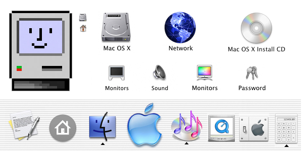
Skipping ahead a bit! According to one article I read, this Mac apparently earned the nickname “jelly mac”
for its ultra shiny and jelly-like finish on its icons.
This is the OS style I remember most vividly, since I used mostly Macs for video editing during my college years that started in 2003.
These icons are a huge leap in design from previous Mac OSes. Mac also added the Dock, which renders the icons from either a straight forward or slightly above point of view. These icons showed reflections and textures, and were a great draw for the user.
2001 Windows XP

Don’t forget about Windows! Microsoft overhauled their OS system again,
introducing a brand new OS with a saturated color palette and an illustrative look.
The icons in Windows XP use a single light source and have a semi-transparent drop shadow. Continuing with the isometric style, these icons were attention grabbing and cutting edge for the time.
2007 Mac OS X Leopard

Apple decides to up its game even further, opting for a very clean, flashy, exciting look.
Check out that 3D reflective doc! The icons sit on them and the use of chrome and glass reflections make this even more popular than before. The icons themselves are pretty much the same as they were in 2001.
2007 Windows Vista

It seems like Vista wanted to get in on the more “reflective” look of its icons in order to keep up with Mac’s innovations.
Interestingly, the icons in Vista are pretty different-looking from what Microsoft releases with Windows 7 later. The Windows 7 icons almost seem like a step back from the glossy, updated look that Vista showcases.
2009 Windows 7

I don’t know about you, but I clung to Windows 7 as long as humanly possible before I finally had to switch to Windows 8.
Windows 7 re-imagines its icons almost completely differently from Windows XP. These icons are “softer” and appear to be more glassy than their predecessors.
2012 Windows 8

I definitely did NOT love this version of Windows. If I’d known about Start8 back in college,
I’d have downloaded it immediately to avoid all of the menu headaches.
The successor to Windows 7 introduced some pretty big changes to the OS’s platform and user interface. Windows 8 was meant to be touch-optimized in order to compete with mobile operating systems like Android and iOS. The Start screen presents programs on a grid of tiles; white icons on backsplashes of color. Admittedly, I like the look here, but I hated the OS as a whole.
2015 Windows 10
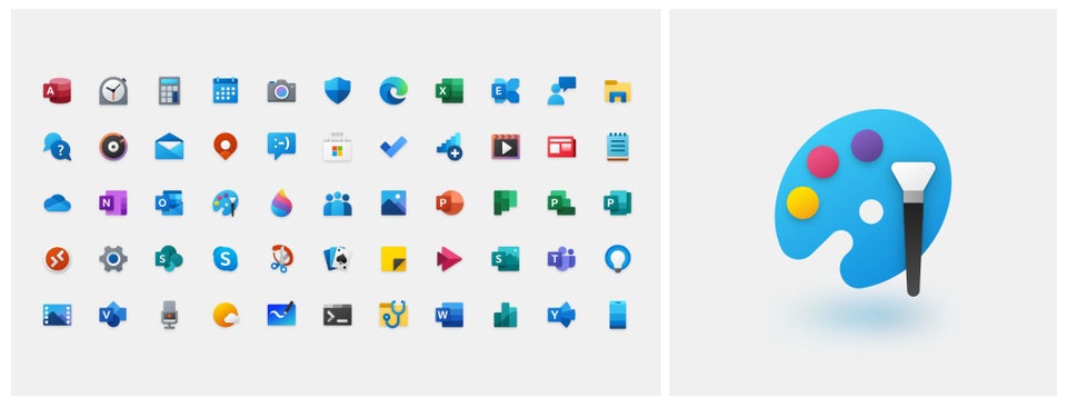
Windows 10 is where we’re at today.
Ah, good old Windows 10. It supports universal apps and the UI was revised in order to handle transitions between mouse-oriented interface and a touchscreen-optimized interface. It also introduced the Edge browser...which, admittedly, I never use personally.
The icons for Windows 10 are modern, sleek, and above all, recognizable.
Honestly, I really loved digging back through the last 40+ years of computer innovation and seeing how icons and imagery have evolved. If you're a fan of custom icons for your PC, make sure you check out IconPackager from our Object Desktop suite! You can replace the default Windows icons - lovely as they are - with cohesive and customized packages of icons that the app provides, or you can make your own! You can also change individual file type icons or recolor entire packages. I wrote a blog about it once upon a time.
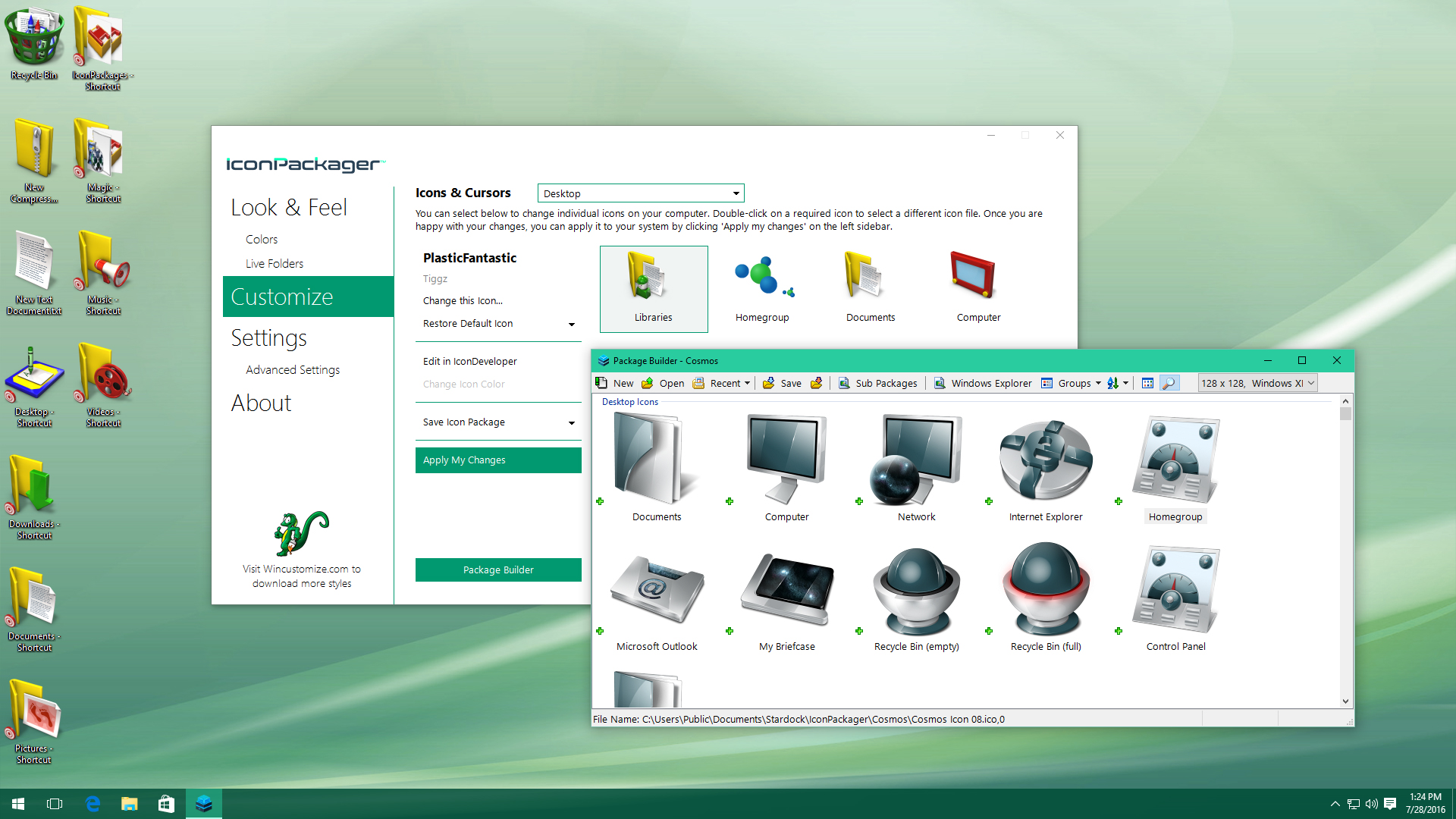
IconPackager will let you build your own icon sets with the included Package Builder!
Which OS has your favorite look? Did you ever use a Xerox Alto? Let me know in the comments!